Typeface Design
✶
Typeface Design ✶
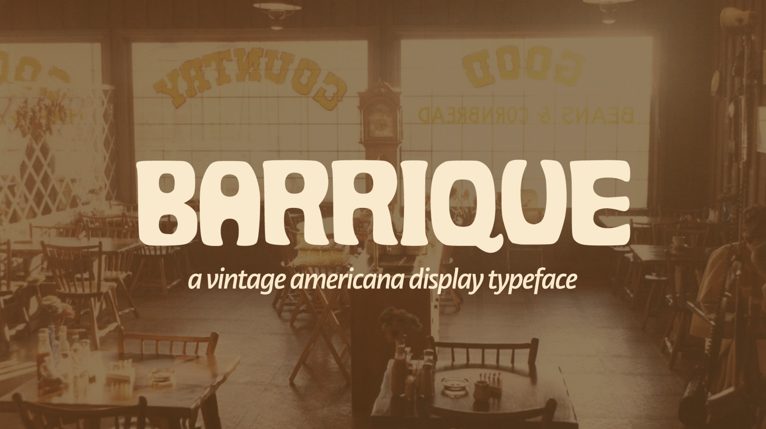
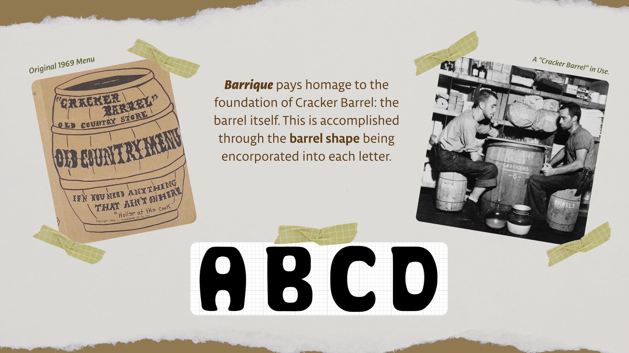
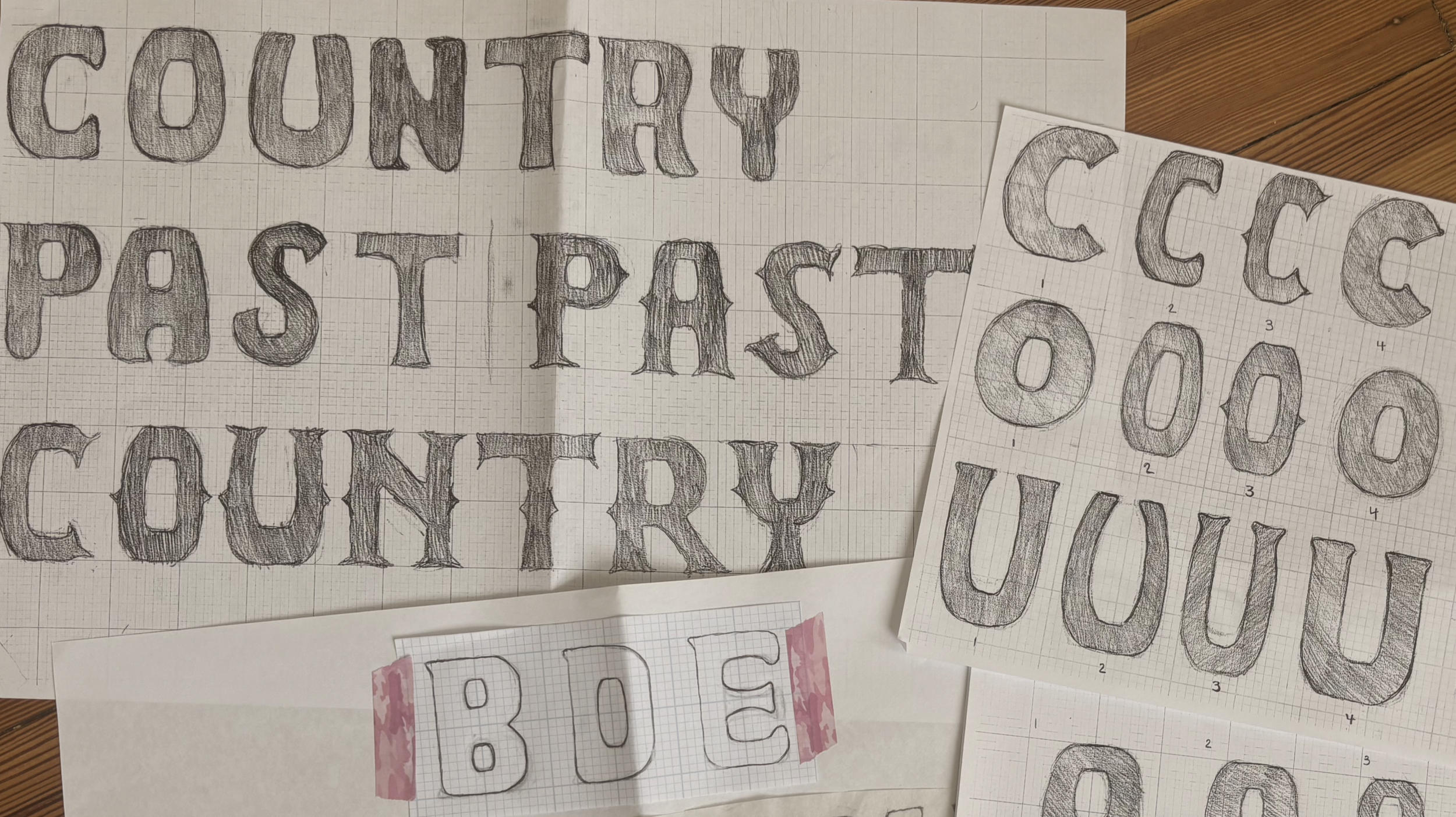
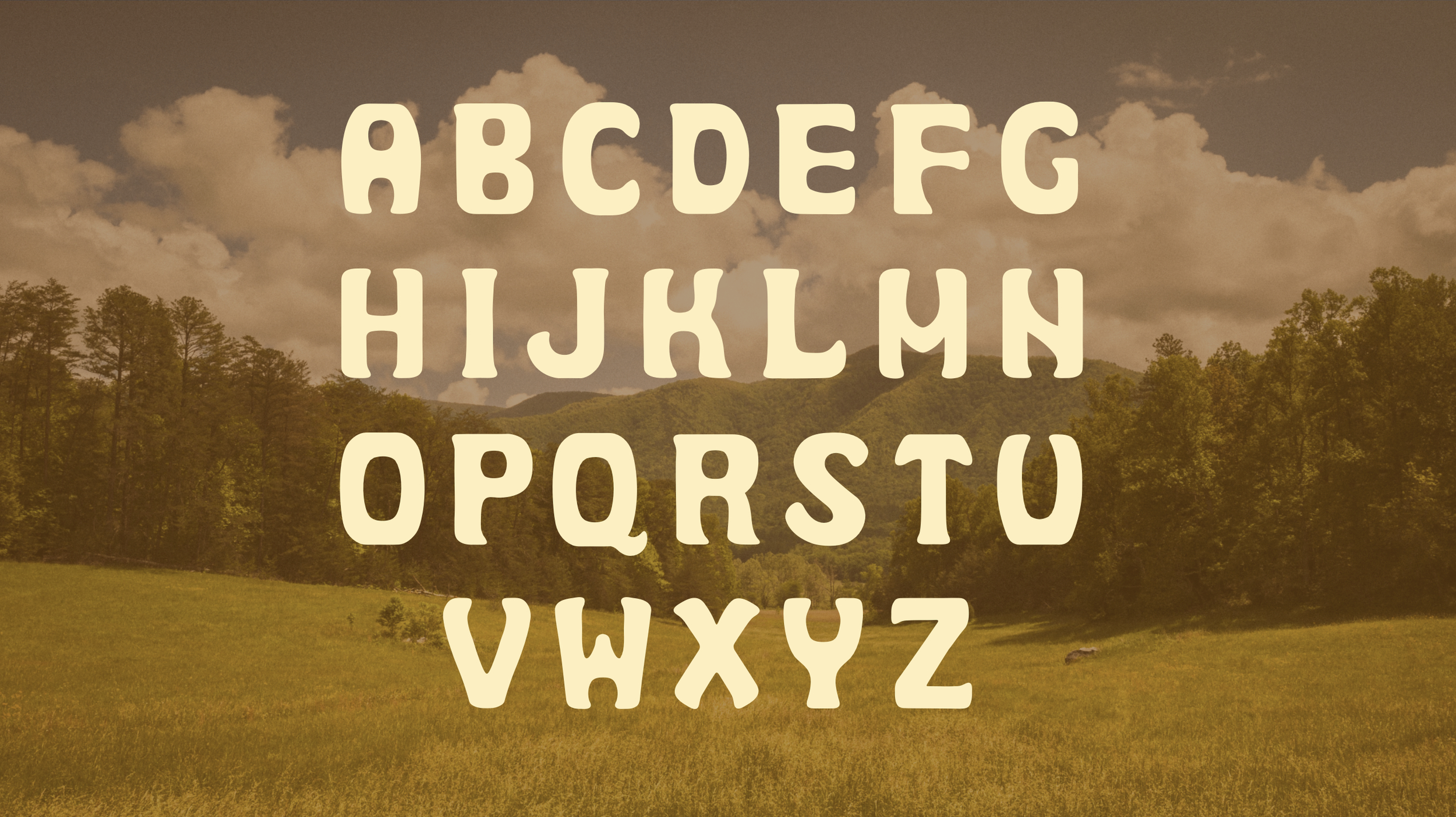
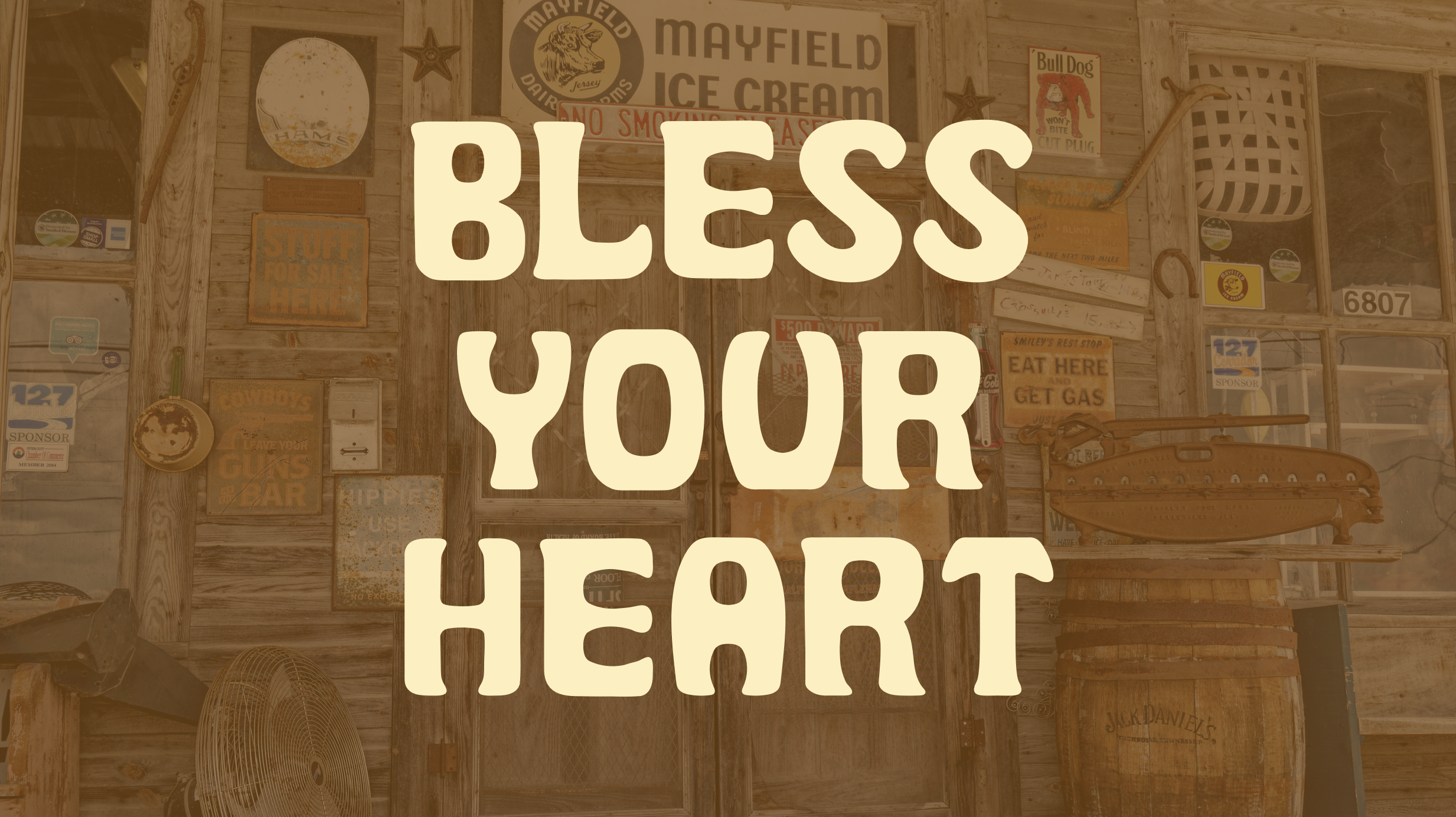
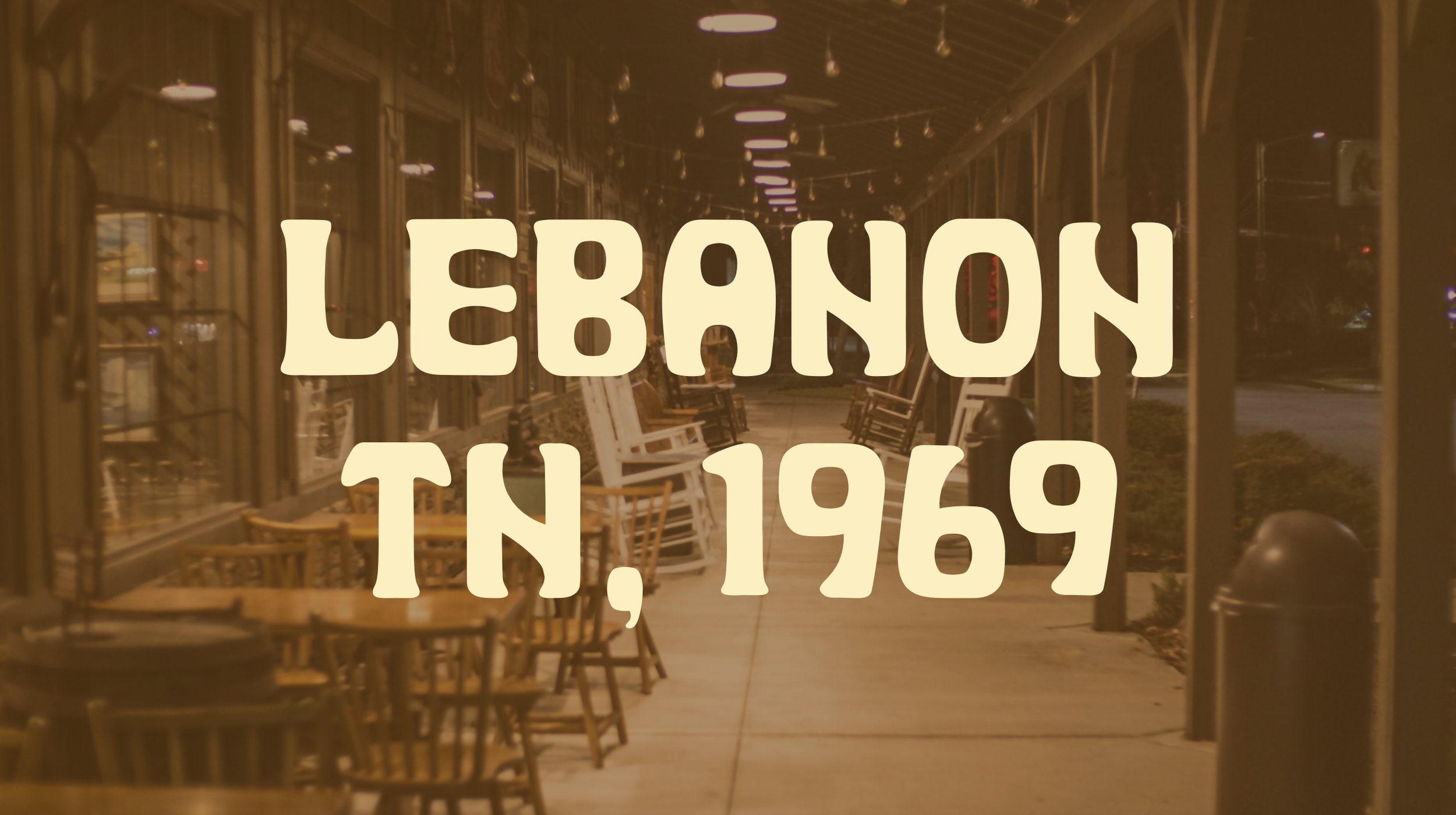
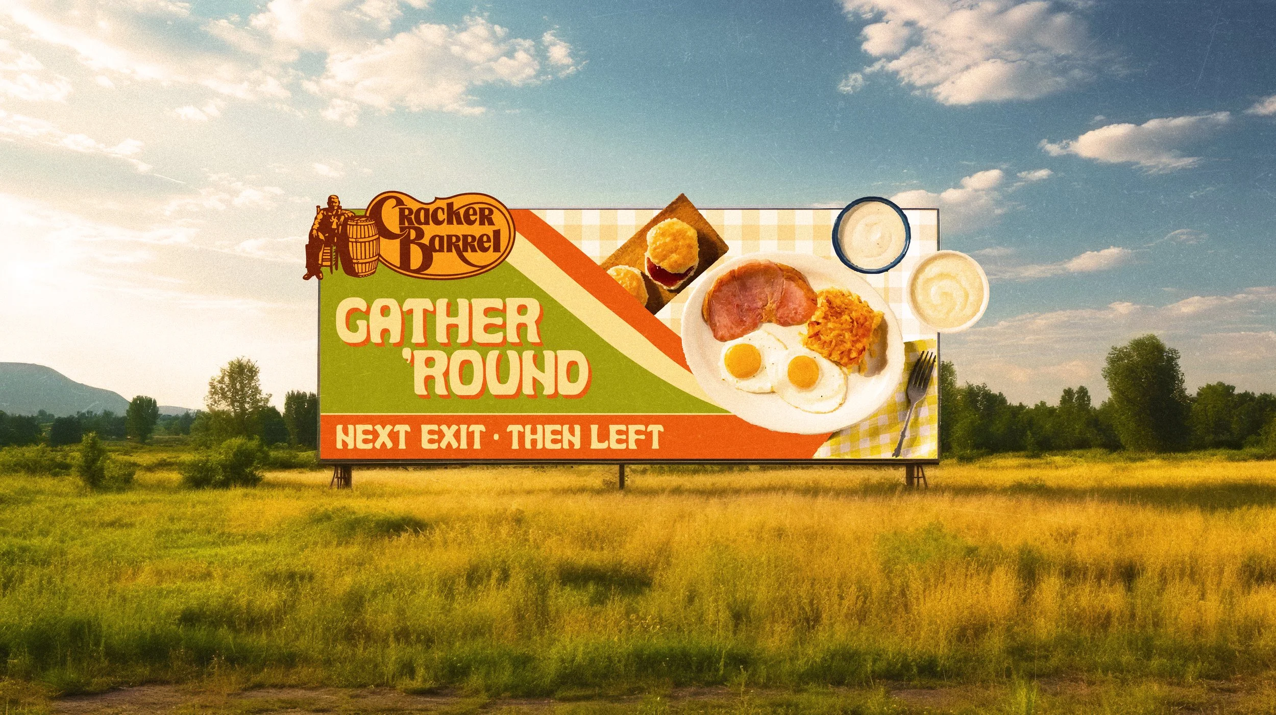
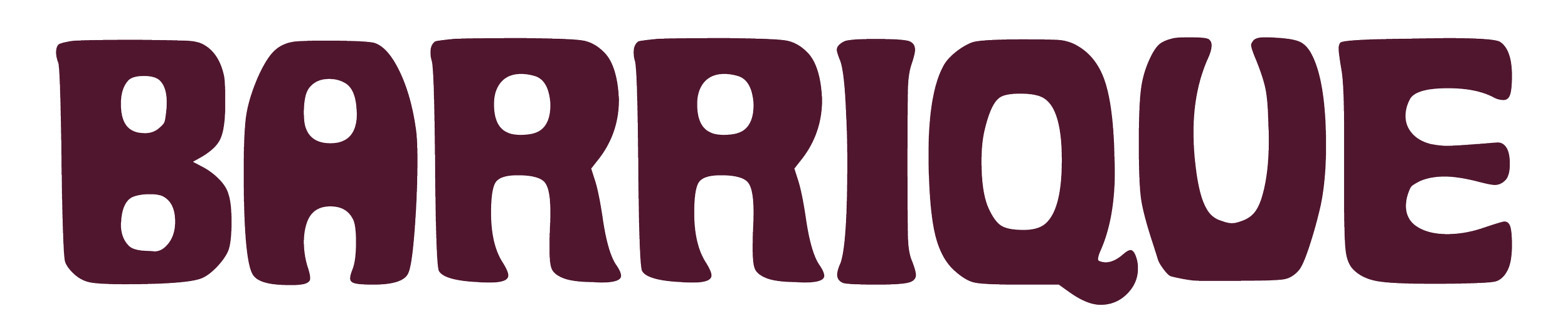
Barrique is a custom display typeface I designed for Cracker Barrel after their failed rebrand attempt. After reading an in-depth case study about it, I realized that the rebrand did not fail due to bad design, but rather that Cracker Barrel customers both old and new crave its nostalgic, vintage, and comforting essence, which the rebrand was lacking. Their strategy was trying to garner a younger customer demographic, but what they neglected to realize is that younger folks appreciate a vintage look as brands nowadays become more minimalistic.
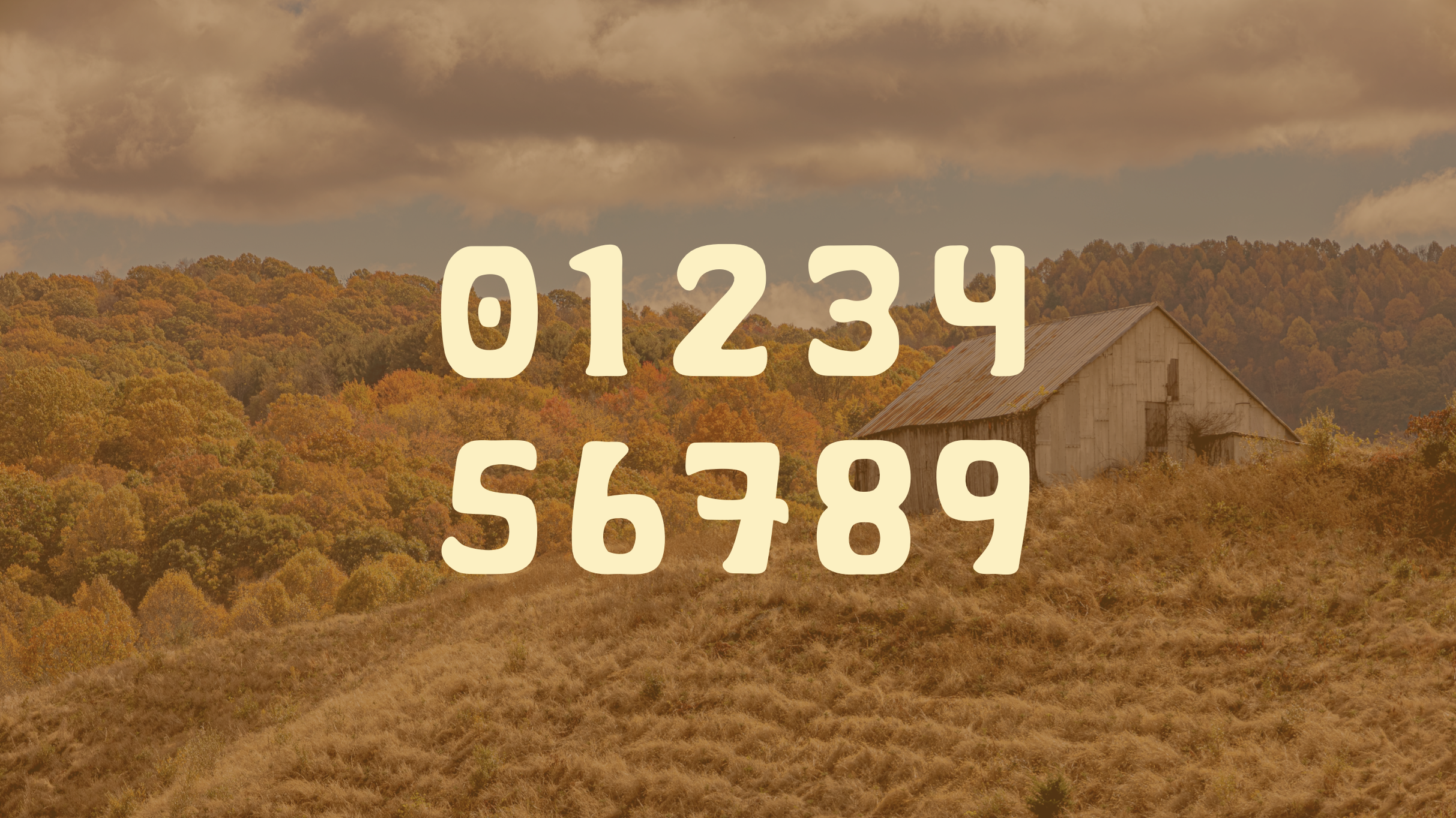
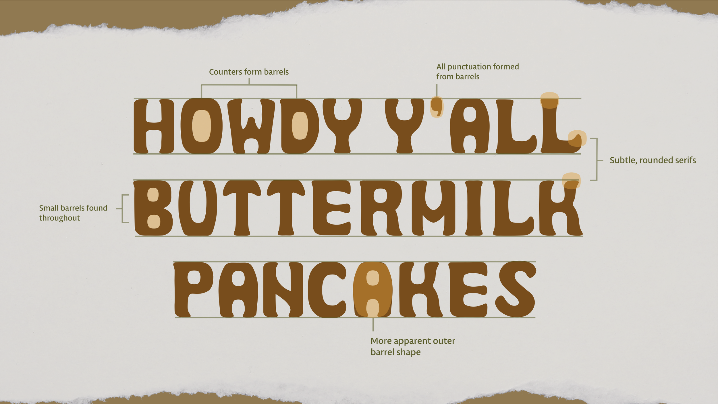
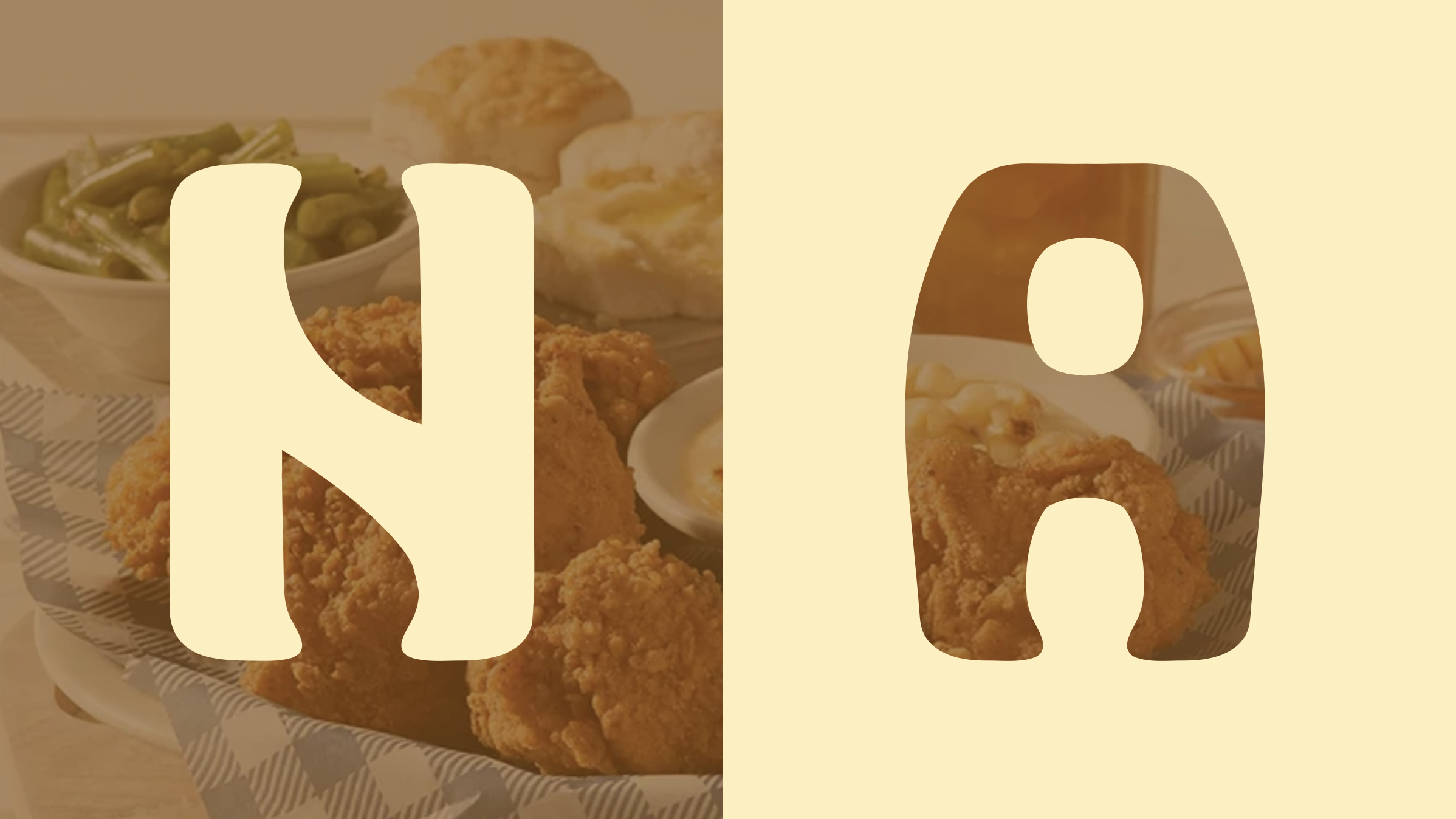
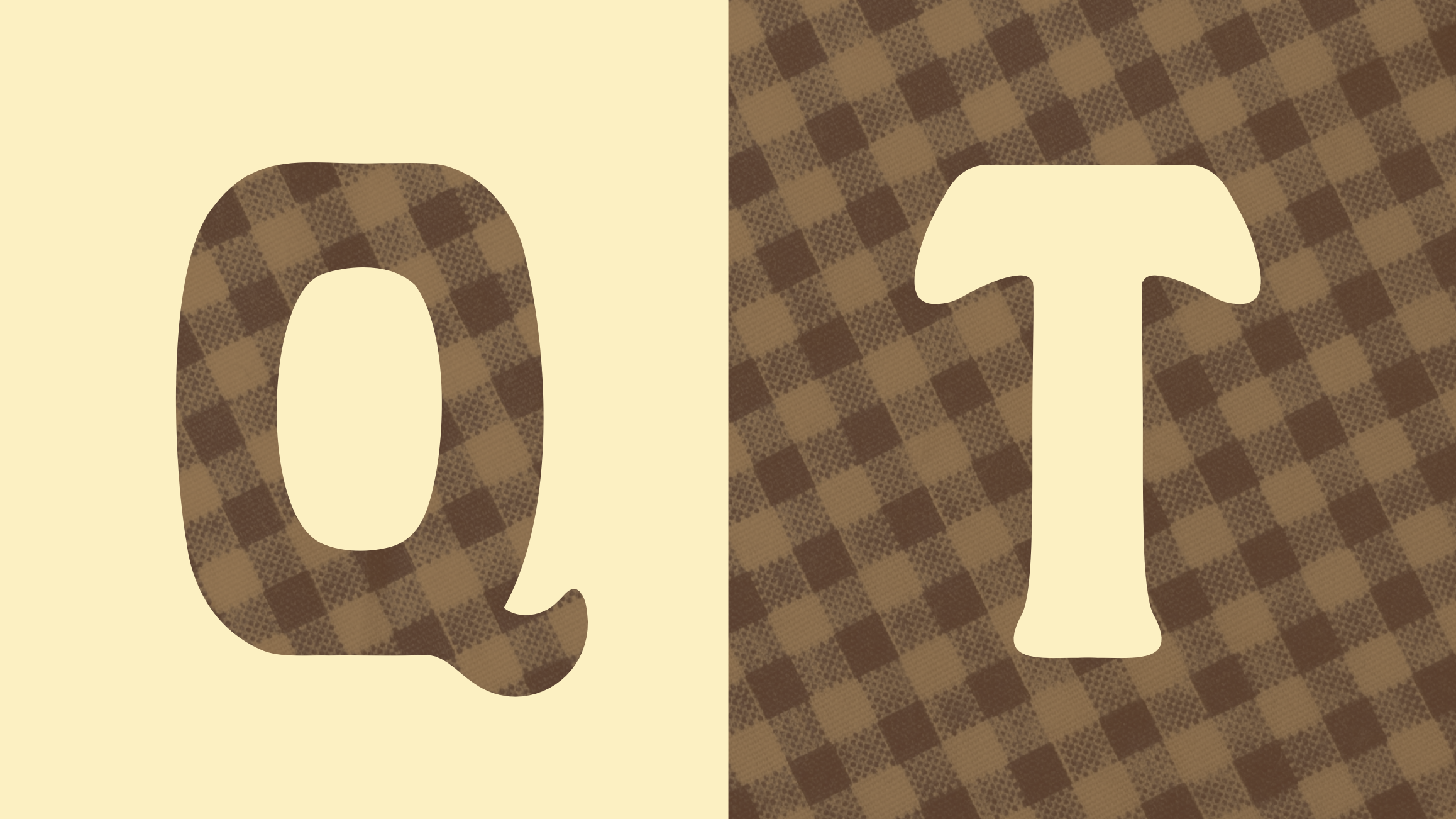
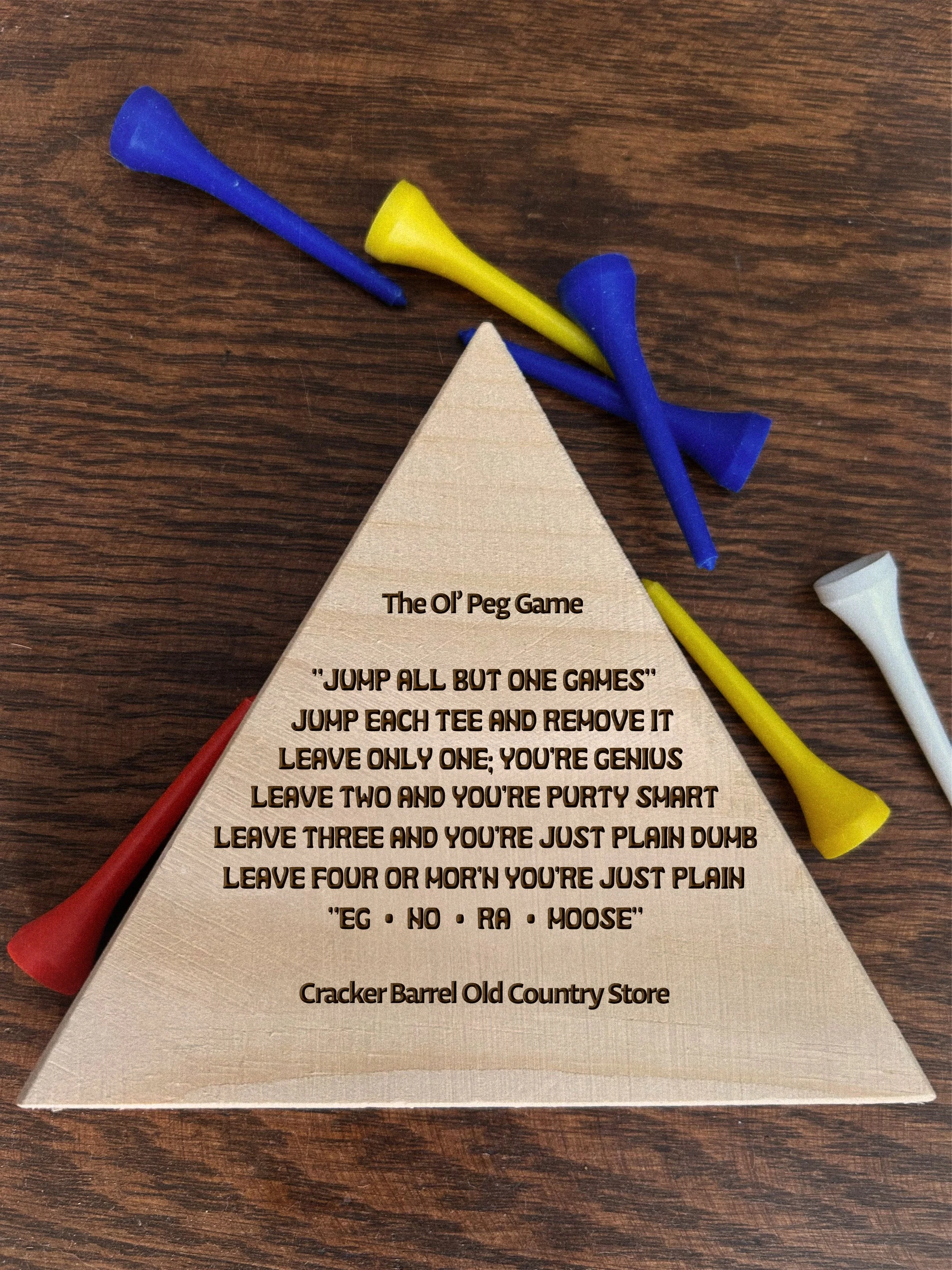
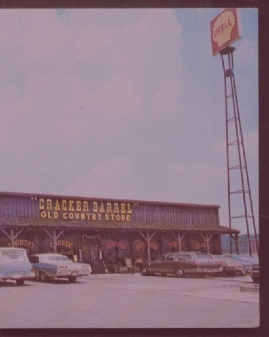
What has remained true about Cracker Barrel since it was founded in 1969 was the recognizable barrel shape. I chose to lean into this iconic shape and used it as the foundation for Barrique. Using the barrel revitalizes the roots of Cracker Barrel’s brand while also creating a vintage intrigue.
Media: Adobe Illustrator, Adobe Photoshop
Target Audience: Trying to get the younger generations on board while still appealing to the loyal, elderly Cracker Barrel patrons.
View gallery below